Nokia Lumia 525 review
That started to change with the introduction of the Lumia 520. With its low price, bright colours and unique design, the Lumia 520 was a breath of fresh air in a dull market segment overflowing with similar-looking Android phones from second-tier brands. According to a recent report, the Lumia 520 accounts for nearly 45 percent of all Windows Phone devices sold in India, and just over 25 percent worldwide.
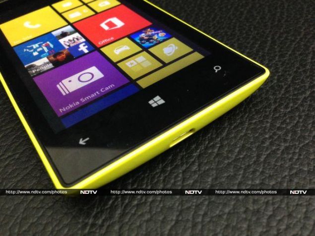
Even so, there was room for improvement. The Lumia 520 was criticised for coming with only 512MB of RAM and dispensing with a front-facing camera. Honestly, though, the front cameras on phones in this price range are generally so bad that they're unusable anyway, and video chatting isn't popular enough for it to be a significant miss. The low amount of RAM was more of an issue, since people were afraid that heavier apps and games wouldn't run well.
The Lumia 525 is thus a mid-lifecycle update which fixes this problem and leaves pretty much everything else exactly as it was. Nokia has responded to buyers' and reviewers' criticisms and has done what it could without raising costs too drastically. It's good to see that the company is on its toes. Even if this helps sway only a few buyers who were earlier on the fence, every small victory counts.
However, the Lumia 525 is still smaller and weaker than many of the Android options available in its price range. Windows Phone is better than it was, but there's still not guarantee that you'll find all the apps you need or the games you'll see your friends enjoy on their Android phones. Let's see if the Lumia 525 has enough going for it to compensate for these factors.
Look and feel
There's no mistaking Nokia's visual identity. The use of bright-coloured polycarbonate was a risky choice, but it's paid off. You might not want to own a bright cyan, magenta or yellow phone, and for that reason they're also available in at least black or white, but you'll always know that these phones are Nokias.
There's no mistaking Nokia's visual identity. The use of bright-coloured polycarbonate was a risky choice, but it's paid off. You might not want to own a bright cyan, magenta or yellow phone, and for that reason they're also available in at least black or white, but you'll always know that these phones are Nokias.
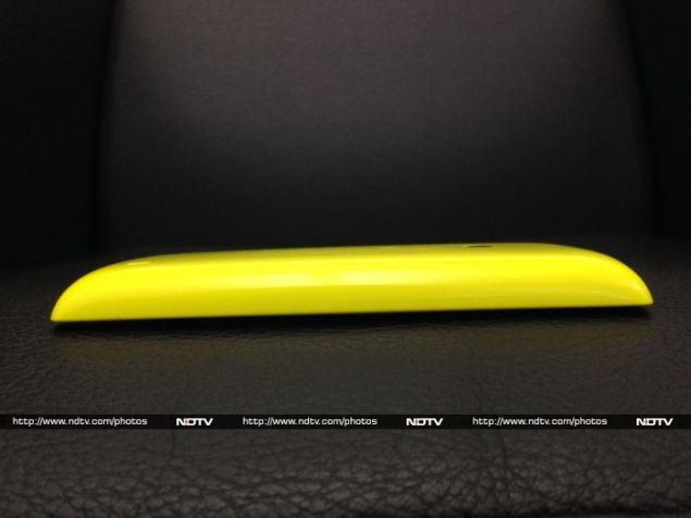
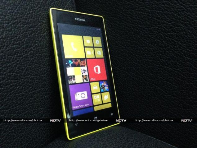
Our review unit had a bright, glossy, almost-fluorescent yellow shell that was sometimes too overpowering to look at. Even when the review unit was lying on its back on a table the side panel was eye-catching enough to be distracting. When viewed head-on, there's about a half-mm border of yellow plastic around the front panel, and that was distracting too! Thankfully, Nokia sells replacement shells in white, orange and yellow, so if you buy this colour only to find it a bit much for your taste later on, you can swap it out.
If you've ever used a Lumia 520, you'll find the 525 identical in terms of dimensions and weight. It's easy enough to hold and use in one hand, and is actually quite small by today's standards. The back is curved nicely, although the front corners are a bit sharp.
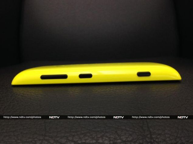
Nokia's habit of placing all buttons on the right edge has become a bit of a Lumia trademark: you'll find the volume rocker, standby button and camera shortcut all in a row. It makes sense to have the power button on the side of larger phones, but on this one it winds up being awkwardly out of reach.
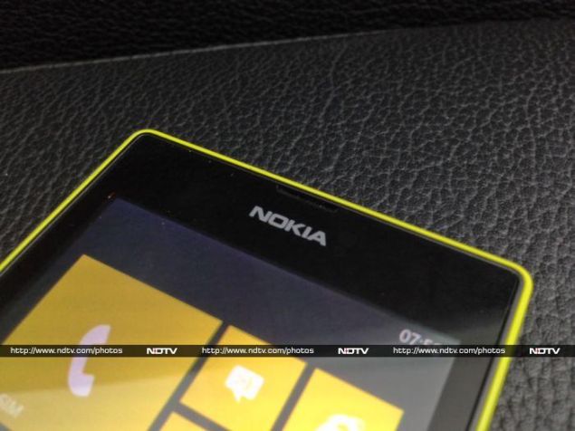
You'll find the standard Windows Phone Back, Home and Search buttons below the screen, and nothing but an earpiece and Nokia logo above it. As mentioned already, there's no front-facing camera. There are two sensor cutouts, but they're completely invisible. If it wasn't for the garish colour, we'd actually say this phone looks simple and understated.
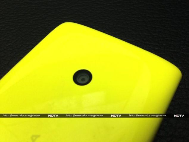
All you'll see on the back is the camera lens, a faint Nokia logo, and a small cutout for the loudspeaker. There's no flash, and the lens doesn't need to bulge out either. The shell is highly glossy and rather flat in the middle, so it's likely to get scuffed up over time as you use it.
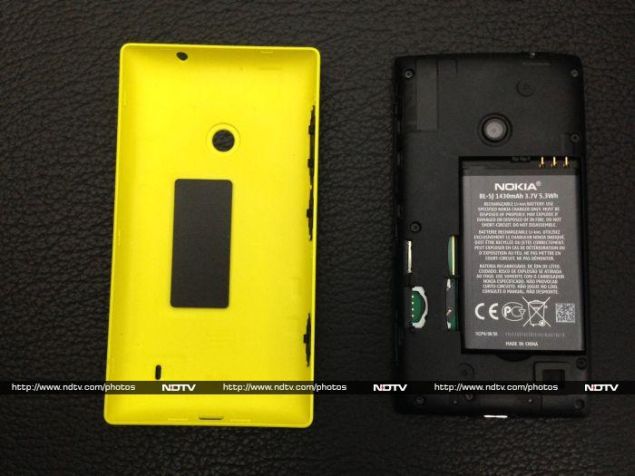
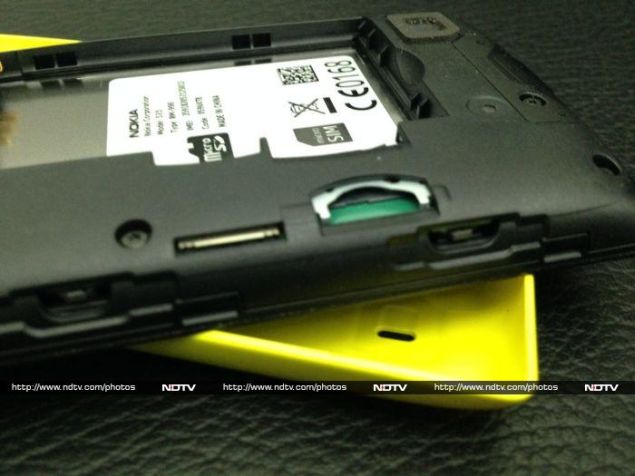
The shell pops off without too much trouble, but it's too easy to end up pushing the camera lens down for leverage, which leaves it smudged. Underneath, you'll see a traditional removable battery and slots for a single Micro-SIM card and a microSD card positioned such that you'll need to take the battery out to get to them. We noticed that it was necessary to put the shell back on carefully, to make sure the plastic buttons on the shell lined up properly with the contact points on the phone itself.
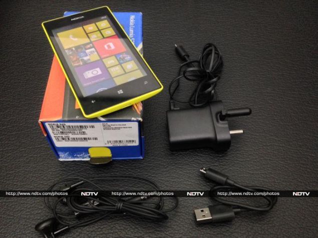
Nokia's recent phones have shipped with chargers that for some reason have a plastic earthing pin. Phone chargers don't need to be earthed, so the only purpose this could serve would be to open the shutters on modern three-pin sockets. The plastic pin slides inwards so the charger itself isn't much more bulky than usual, but it means you won't be able to use two-pin sockets. The Lumia 525's charger also has a fixed wire, unlike almost every other phone on the market today. For PC syncing there's a separate, but much shorter USB cable.
Features, specifications and software
Apart from the doubled amount of RAM, the Lumia 525 is internally identical to the 520. It's powered by a 1GHz dual-core Snapdragon S4 Plus, with integrated Adreno 305 graphics. The S4 Plus is acceptable for such a low-end device, but there are quad-core Android models on the market in this price range now. The lone camera can take 5-megapixel stills and 720p videos, but there's no flash.
Apart from the doubled amount of RAM, the Lumia 525 is internally identical to the 520. It's powered by a 1GHz dual-core Snapdragon S4 Plus, with integrated Adreno 305 graphics. The S4 Plus is acceptable for such a low-end device, but there are quad-core Android models on the market in this price range now. The lone camera can take 5-megapixel stills and 720p videos, but there's no flash.
The screen resolution is 480x800 which was common in the early days of Windows Phone, and now feels about right for a 4-inch screen on a low-end phone. The screen isn't nearly as sharp or accurate as we'd like. There's 8GB of built-in storage and the microSD slot will accept cards up to 64GB in capacity. Nokia has given the Lumia 525 a relatively small 1430mAh battery which is adequate considering that none of the internal components are particularly power-hungry.
A quick dip into the phone's info screen told us that it was running Lumia Black, the latest version of Windows Phone with Nokia's customisations baked in. However, many of the useful little tweaks that we saw on Nokia's higher-end Lumia 1320 and 1520 are missing here: there's no Glance screen and no shortcuts like double-tap-to-wake. You'll also get the less capable Nokia Drive app, rather than Drive+. The difference is that you get navigation and turn-by-turn directions only in India rather than full international coverage.
Nokia Smart Cam lets you take bursts of photos and then either pick the best one or combine them all into an action sequence. You can also blur backgrounds to emphasise motion, merge shots to make sure everyone in a group is smiling, and remove unwanted moving objects. As we've seen even on more capable hardware, it's possible to get good results with the tricks that merge multiple shots, but you'll have to try a few times to make sure people or objects are moving at just the right speed, with just the right background.
There isn't much else to say about the Lumia 525's software. Nokia preloads Zinio, a news aggregation and magazine reader app; Bigflix, for streaming Indian movies; Flipkart's ebook reader; and Nokia Beamer, which lets you stream your screen's contents to a Web browser via the Internet. Of course you get Microsoft Office, Xbox Games and SkyDrive (soon to be renamed to OneDrive) as well.
Camera
We were very pleasantly surprised by the quality of images captured by the Lumia 525. The only complaint we had with photos taken in daylight was that they tended to be a bit overexposed, thus making colours appear washed out. The level of detail captured, even when focusing on grass, is amazing considering this phone's entry-level status.
We were very pleasantly surprised by the quality of images captured by the Lumia 525. The only complaint we had with photos taken in daylight was that they tended to be a bit overexposed, thus making colours appear washed out. The level of detail captured, even when focusing on grass, is amazing considering this phone's entry-level status.
With no flash to help out at night, it seems that Nokia has developed a way to make low-light shots brighter. When taking photos, we were surprised by how they made rooms look lit up even when the only light was coming from outside. This comes at the cost of clarity and detail, and you'll notice a lot of noise and speckling when looking at these photos at 100 percent zoom.

(Click to see full size)
Performance
We were happy enough with the Lumia 525's performance when it came to navigating through the interface. The phone took a bit of time to load some apps, but things were otherwise smooth. We noticed some graphical glitches in Temple Run 2, which really shouldn't have put that much stress on the phone. With that in mind, it would seem that high-end games are totally out of the question.
We were happy enough with the Lumia 525's performance when it came to navigating through the interface. The phone took a bit of time to load some apps, but things were otherwise smooth. We noticed some graphical glitches in Temple Run 2, which really shouldn't have put that much stress on the phone. With that in mind, it would seem that high-end games are totally out of the question.
Benchmark scores came in at roughly half as much as the Lumia 1320's, which in turn were roughly half as good as the Lumia 1520's. It's clear that you get what you pay for, and so Nokia's new entry-level Lumia remains exactly where the 520 was in terms of both performance and value. We'll have to wait for the next generation to see Nokia up the ante.
It should come as no surprise that the Lumia 525 struggled to play HD videos. Simple AVI files worked fine, but anything encoded at a heavy bit-rate should be avoided. The built-in speaker is loud enough, but sounds a bit hollow and tends to distort sound at if the volume is set higher than halfway up.
Our battery life loop test took 7 hours, 17 minutes to kill the Lumia 525 with Bluetooth and Wi-Fi switched off and the screen brightness set to Medium. That's a pretty decent figure, and you should be able to get through a full day of calls, texts, music and simple Web browsing.
Verdict
The Lumia 525 is a small, affordable phone with a surprisingly decent camera and plenty of attitude, but not much else going for it. When held up to similarly priced Android phones, it's hard to make a case in favour of Windows Phone, which is why Nokia has capitalised on looks and ease of use.
The Lumia 525 is a small, affordable phone with a surprisingly decent camera and plenty of attitude, but not much else going for it. When held up to similarly priced Android phones, it's hard to make a case in favour of Windows Phone, which is why Nokia has capitalised on looks and ease of use.
If you're looking for the most powerful phone available for around Rs. 10,000, this is not it. You'd be better off with Lenovo's A706, for example. However there is one very clear market for the Lumia 525: first-time smartphone users. If you're graduating from feature phone (Nokia or otherwise) and are looking for a phone that will let you browse the Web, take good photos and use Facebook or WhatsApp easily and in style, this phone is a pretty decent option.


0 comments:
Post a Comment